Souls Setup
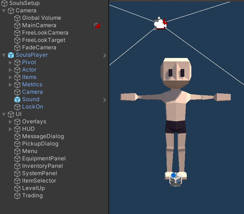
The following is an overview of the SoulsSetup prefab in the AdventureSouls demo. This prefab contains all the components required for the gameplay of the demo.

SoulsSetup
The first component in SoulsSetup is the SoulsCommons component. This component can be seen as the general game manager of the demo. It contains such general logic as scene loading and switching. It also holds references to common attributes, resources, stats and damages. SoulsCommons is a Singleton and accessible through the static Instance variable. This allows for example checking damage types by comparing incoming damage to SoulsCommons.Instance.PhysicalDamage.
The next couple components are related to Persistence. During regular gameplay, started from the title screen, the Index of the persistence container gets set by SoulsCommons. When scenes are started directly the index in the field is used. In most debug scenes the Saver field of the container is set to None to disable persistence and start fresh each time. To debug persistence that change can be reverted which should keep game state across starting and stopping the editor. Clearing player prefs may be needed before doing so to avoid loading save data that positions the player somewhere outside the environment.
The final component in the root game object is the FocusHelper which manages application focus and cursor lock. It has some special handling for the editor which disables the mouse input device if the game view is not focused. Otherwise the camera would move while outside the game view and the character would attack whenever clicking into it. It is still possible to exit the game view without disabling the mouse by pressing Win instead of Esc.
Camera
This GameObject contains all the various camera components. This includes a volume URP component that adds some minor post processing. The MainCamera object contains the actual unity camera, the AudioListener and the central CinemachineBrain.
FreeLookCamera contains the third person camera used in regular gameplay. It gets controller by the lockable camera inside the souls player. The object also contains a collider that keeps the camera from clipping into the environment. The offset component is used when the player is aiming to nudge the camera to the side and give a better view.
The FadeCamera virtual camera is used to fade out the screen. This happens, for example, on death and is controlled by the corresponding timeline.
SoulsPlayer
This nested prefab contains the player character itself and is explained in detail on the SoulsPlayer manual page.
UI
This is where all the UI components can be found. The souls demo uses both the new input system and ui toolkit. The input module and player input components that bind those together can be found in the root game object. You may notice that the input asset contains different actions for submitting and navigating the ui between the title and regular scenes(Navigate/NavigateTitle). This is done so character keys like E or WASD don’t interfere with the character name input in the title.
The Overlays and HUD objects contains different resource bars which are reusable components from AdventureCore.
Next up are two different dialogs, one for general messages(MSG) and another for pickups(PCK). They are used by the souls talk and pickup actions which access them by their Key.
The Menu object contains the logical behaviour and ui document of the menu that is displayed when the player presses Esc(or Tab in the editor). It also manages showing and hiding the three different panels beneath it.
Finally the ItemSelector, LevelUp and Trading objects contain dialog used in different situations. They each contain a custom MonoBehaviour that contains their logic and lets other components use them and a UI Document that contains the actual UI and its layout. Open the behaviour script to get more detailed explanations of the different script or click the ? button in the inspector to access the api documentation.
All the different ui documents in souls reference the SoulsStyle.uss style sheet. This style sheet defines the look of the UI including simple settings like margins and colors but also the animation that brings in the boss health bar.(triggered in SoulsHUG.ShowBoss)